This study showcases how I would approach the same interface that google stitch had created—refining layout, adding thoughtful interactions, and aligning visuals with user intent. It reflects my personal design sensibilities and how I translate prompts into intuitive, beautiful UI
Project type
Revamp
Tools
Figma / Google stitch / Adobe firefly / leanardo ai
Timeline
1 day
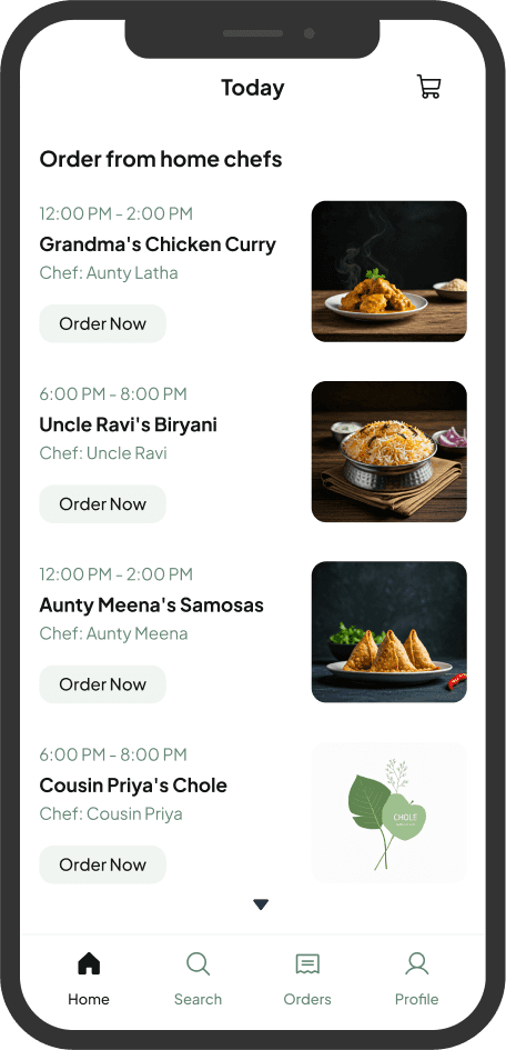
Prompt used
Design a high-fidelity mobile app home screen for a minimalist food delivery app called HomeYum. The app connects users with nearby home chefs for daily home-cooked meals. The screen should show a soft, cozy interface with pastel colors (mint, butter yellow, rose pink). Display a daily menu feed with meal cards featuring dish photos, name of the dish, name of the chef (e.g., “Aunty Latha”), serving time, and a prominent one-tap “Order Now” button on each card. Use rounded containers, playful iconography (like tiffin boxes and steam), and subtle background textures or shadows. The design should feel warm, emotional, and nostalgic—like a handwritten note from your mom.
Take aways
The inclusion of chef names makes the platform feel warm and familiar
Engaging title adds a homely and affectionate vibe
The interface is structured in a way that makes it easy to browse
Missing features
Additional information like ingredients or portion sizes could help users make informed decisions
The current color scheme does not evoke the warmth or homely feel that the UX writing conveys
Mentioning only one dish might limit user engagement. Featuring a variety of popular dishes could make the UI more dynamic and enticing.
Some elements appear muted, making the interface feel less engaging.
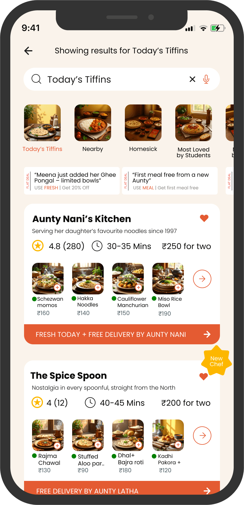
My Approach
I designed this kitchen display page to create a warm and inviting experience, using a homely color palette that evokes comfort and familiarity.
By addressing chefs as "Aunty," I wanted to add a personal touch, making users feel like they’re ordering from someone they trust.
I also improved the UX writing by infusing emotions into the descriptions, transforming the interface into more than just a menu—it’s a story that connects users with the food they’re about to enjoy
I highlighted offers prominently to ensure they catch the user’s attention, making meals more appealing
use of mouth-watering images enhances visual appeal, creating an irresistible experience.