Nike’s website taps into core neuromarketing principles that influence how users feel, focus, and make decisions. This case study explores how Nike uses these subtle yet powerful techniques to build trust, inspire action, and keep their brand top of mind.
Project type
Research
Tools
Figma
Timeline
1 day
This study was performed to comprehend how a universally respected brand, such as Nike, applies the principles of neuromarketing to craft a web experience that is much more than merely beautiful. Although Nike is an icon of strong visuals and even stronger branding, what really differentiates it is how it forges an emotional bond with users and, through design, directs their decisions. As a creator, being privy to Nike's ways of working provides a window into how to craft not only gorgeous but also powerful, conversion-centric digital experiences. It allows for the sharpening of both the creative and the strategic sides of design thinking, to say nothing of the kinds of big emotional and business outcomes that even small choices can lead to.
Key principles
Emotional design
Color psychology
Cognitive load
Social proof & trust
Scarcity & urgency
Memory and consistency
Mirror neuron activation
Emotional design
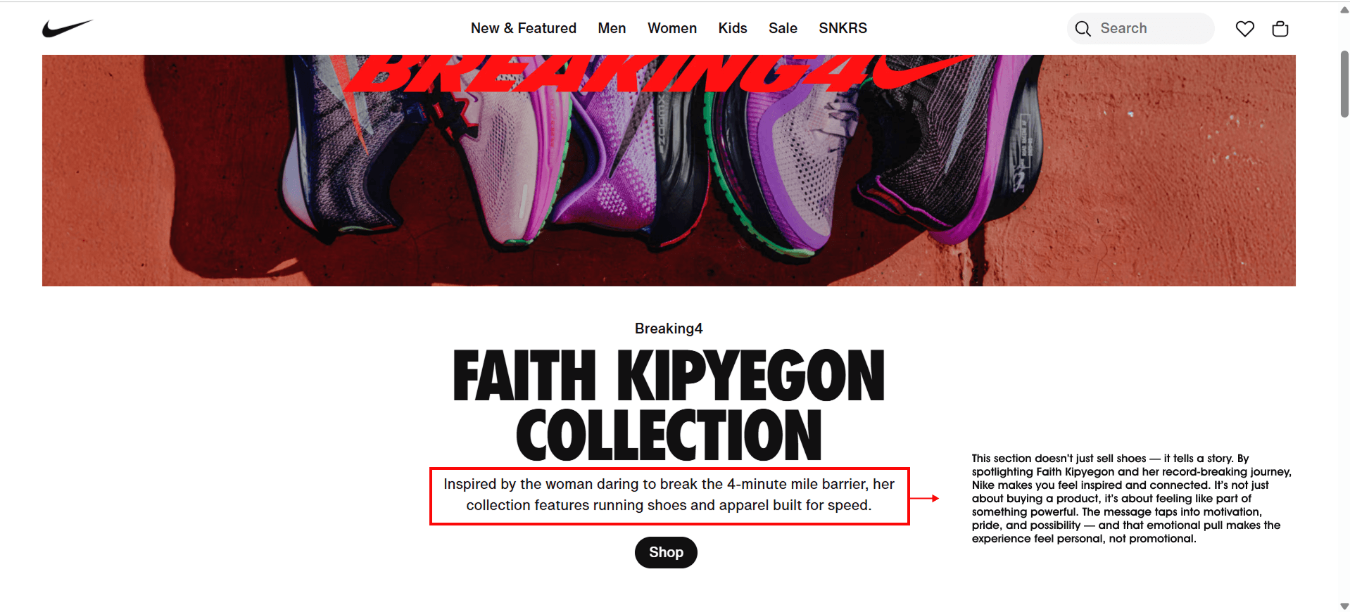
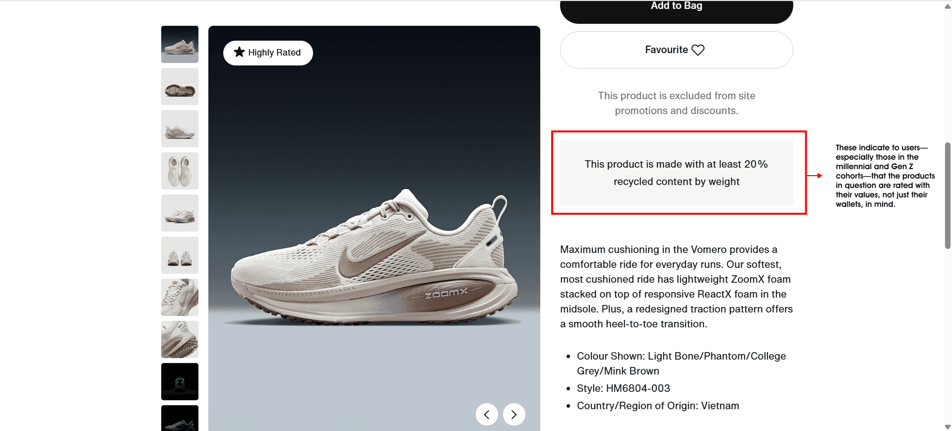
Nike tells stories that really make you feel something whether it’s a bold headline or a moment of an athlete mid-stride, there’s always emotion behind it. The visuals are full of movement and power, and they instantly spark a sense of motivation. Simple details like calling out “Highly Rated” or mentioning that a product uses recycled materials show that Nike knows what matters to people today performance, but also purpose. And what really stands out is the tone: it’s strong, inclusive, and uplifting. It doesn’t just sell it speaks to who you are and who you want to be.
Color psychology
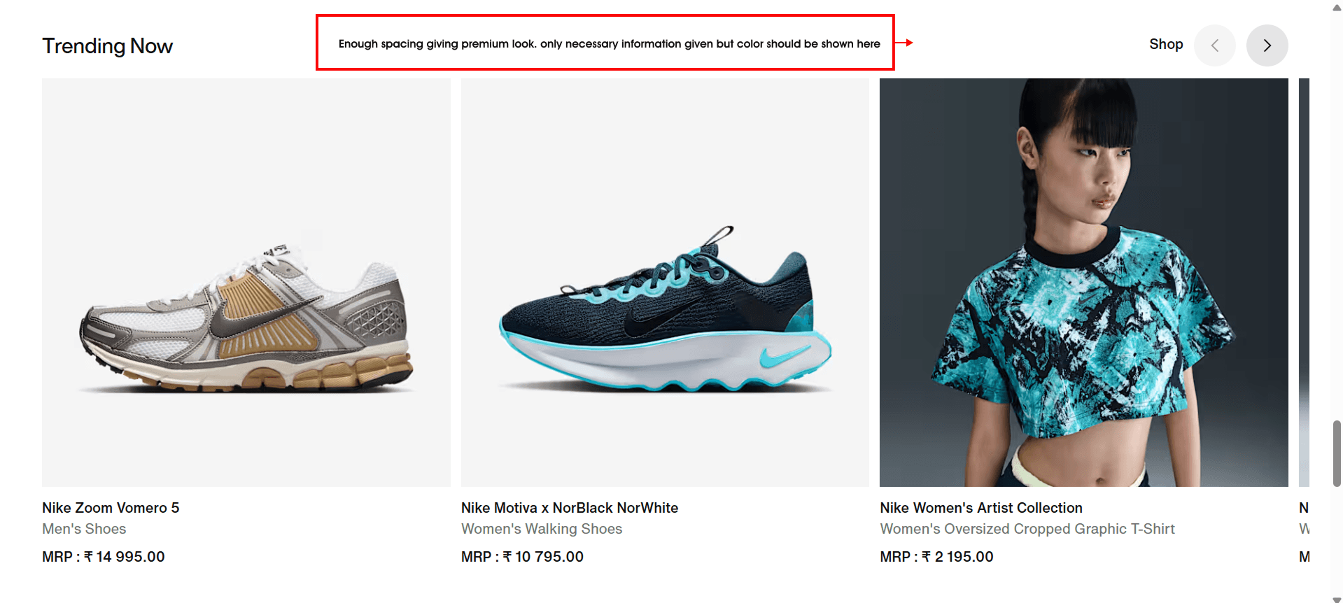
Nike keeps things clean with a black, white, and grey palette — it lets the products shine without any distractions. When they do use color, it’s with purpose. Red pops up just enough to catch your eye on limited-time offers or important deals, creating a sense of urgency without feeling too loud. It’s smart, subtle, and super effective.
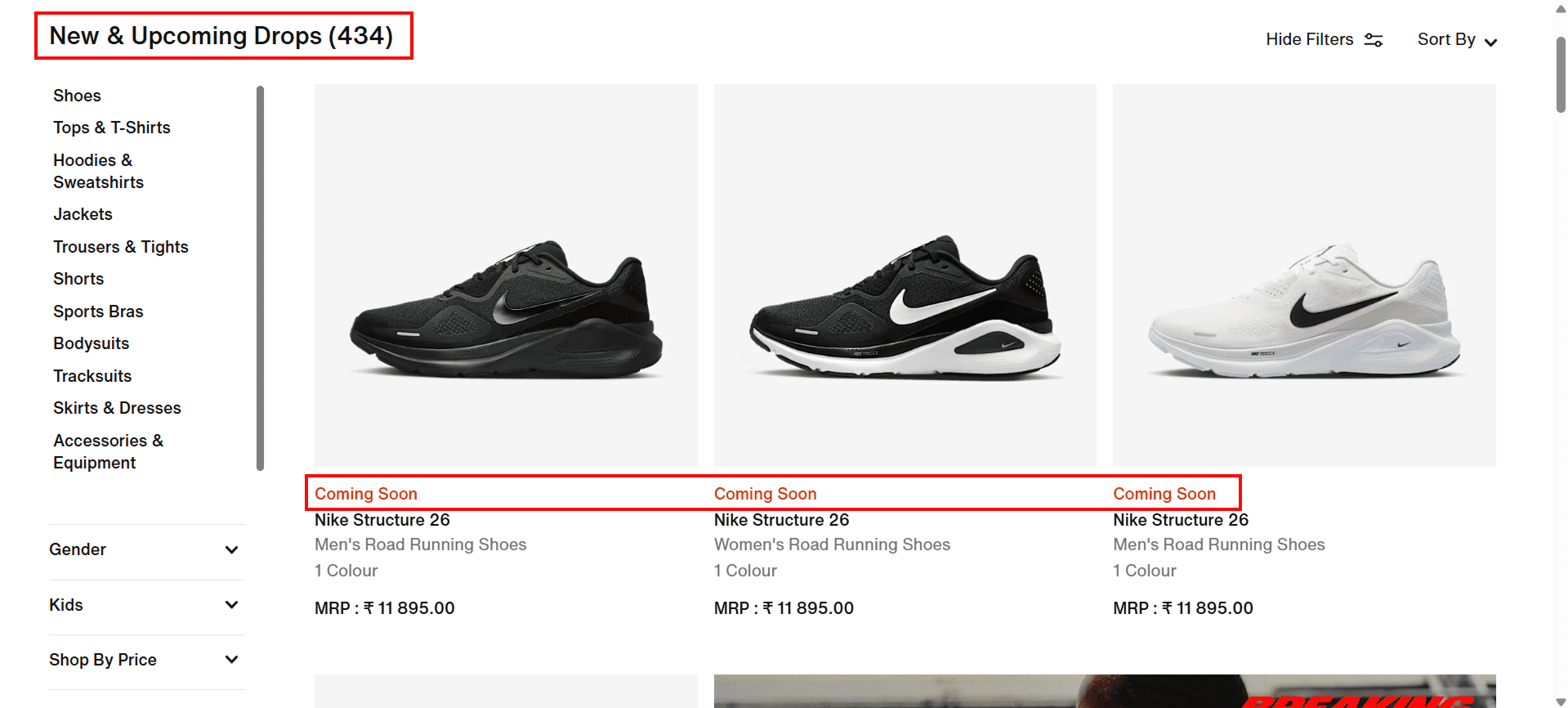
Cognitive load
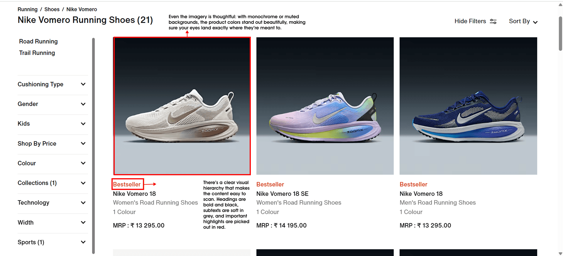
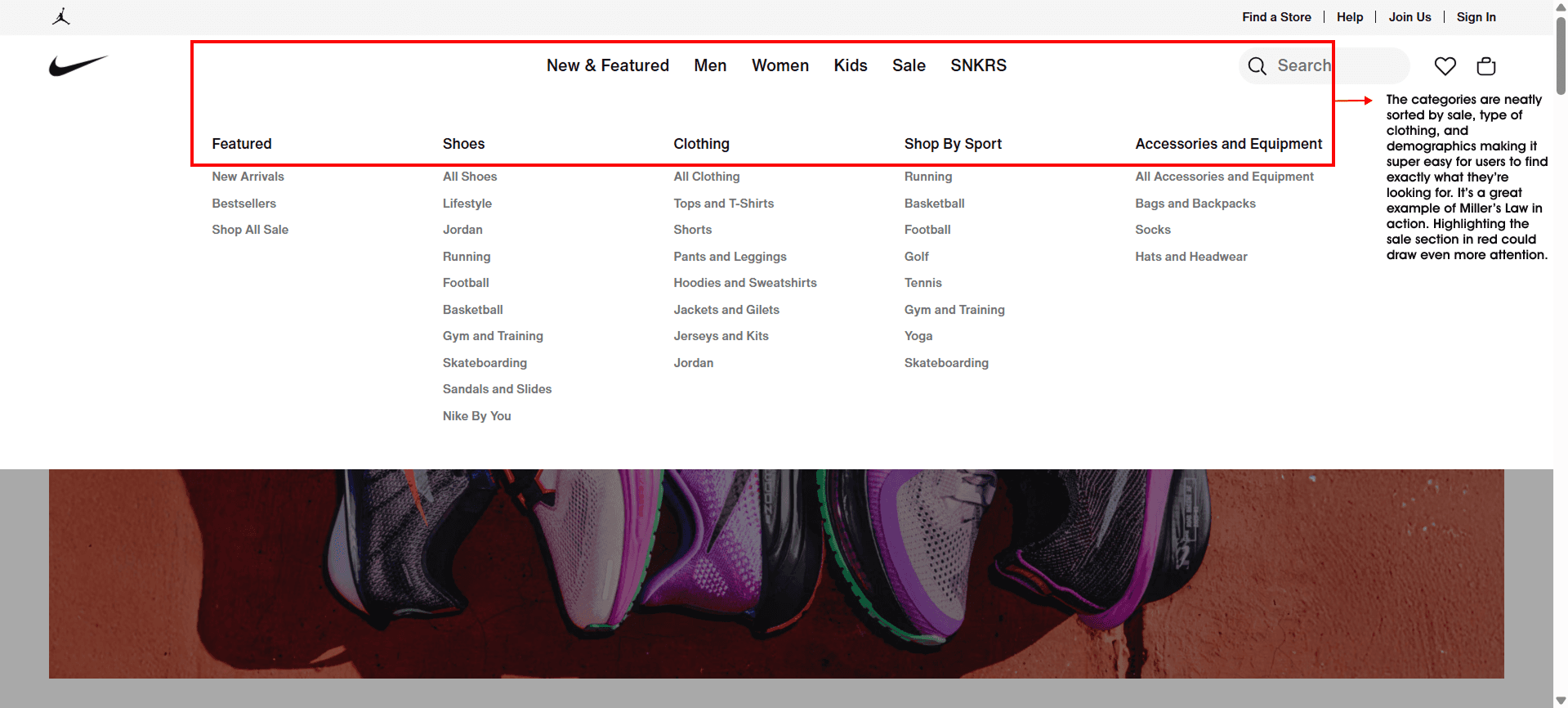
The layout feels clean and easy to breathe in there’s plenty of white space that keeps things from feeling overwhelming. Categories are grouped clearly, and the product tiles are laid out in a way that makes browsing feel effortless. From landing on the homepage to checking out, the flow feels natural and smooth. There’s also a clear hierarchy throughout with font sizes, spacing, and weight guiding your eyes gently without ever shouting for attention.
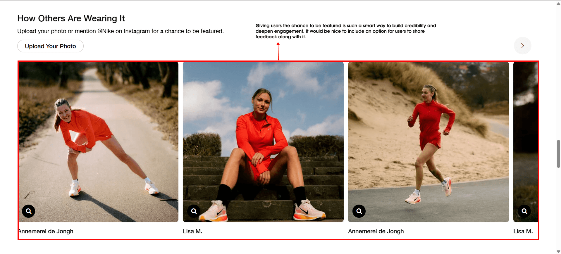
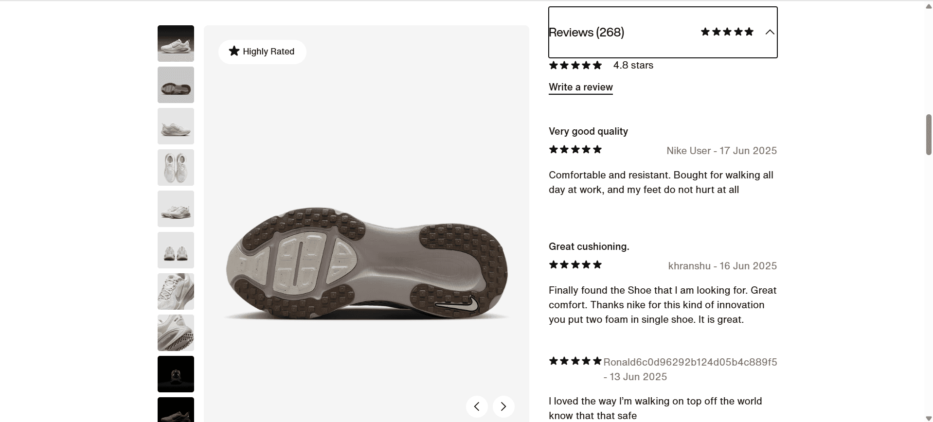
Social proof & trust
Nike builds trust in subtle but powerful ways. Tags like “Best Seller” and “Most Loved” immediately show what people are loving, while customer reviews add that extra layer of reassurance. And with familiar faces from athletes to celebrities Nike makes you feel like you're part of something bigger. It’s not just about buying a product; it’s about belonging to a community that inspires.
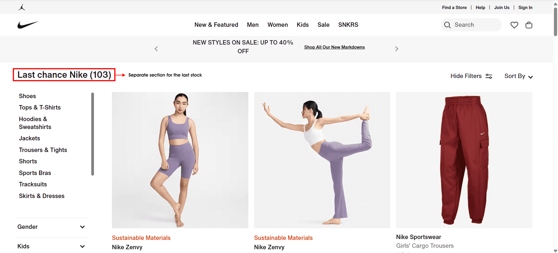
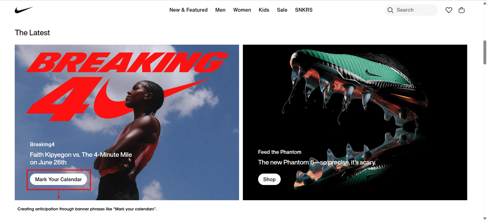
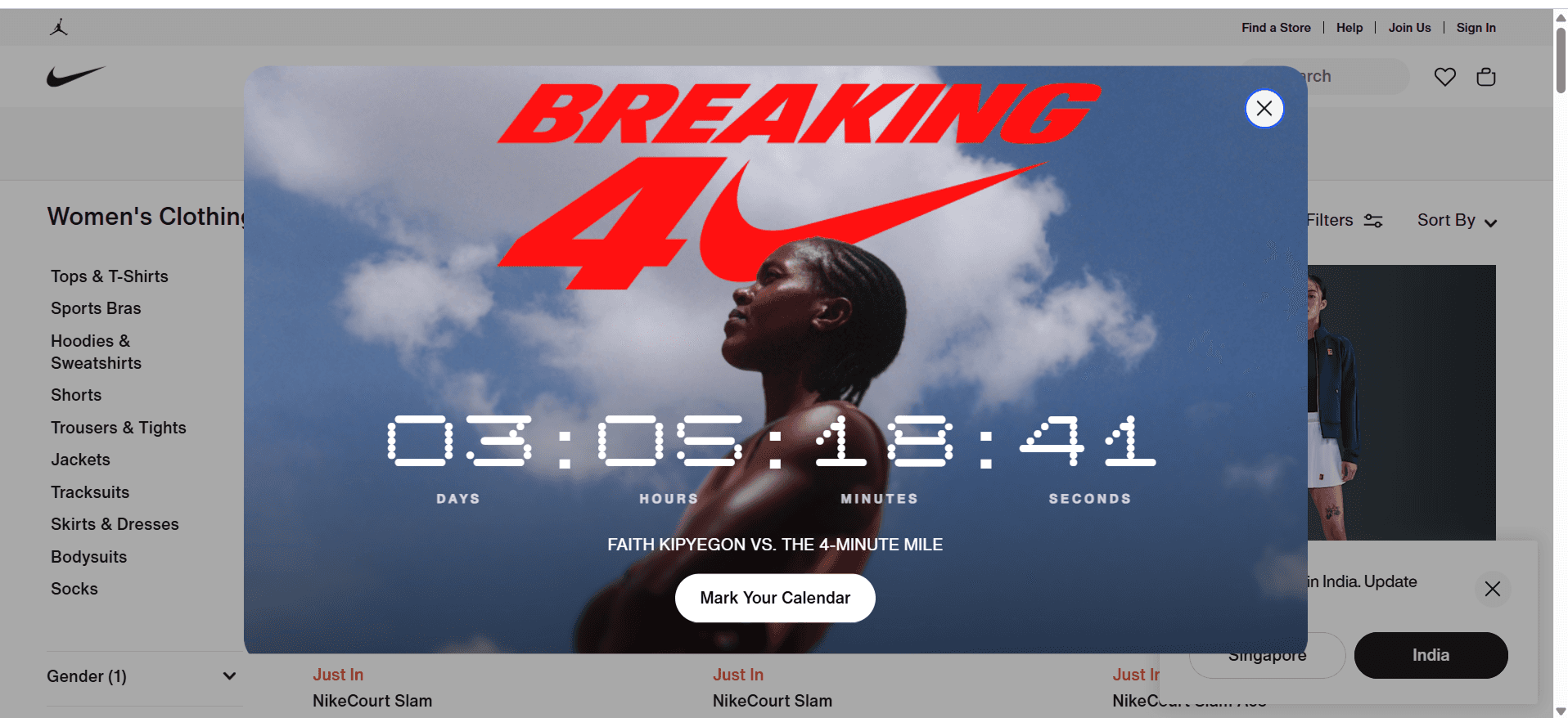
Scarcity & Urgency
Nike creates a sense of urgency in all the right ways. Limited-time offers and seasonal drops are clearly highlighted through banners and dedicated sections, so you never miss out. Phrases like “Mark your calendars” add a playful touch of anticipation, building hype without pressure — just enough to make you want to check back in.
Mirror Neuron Activation
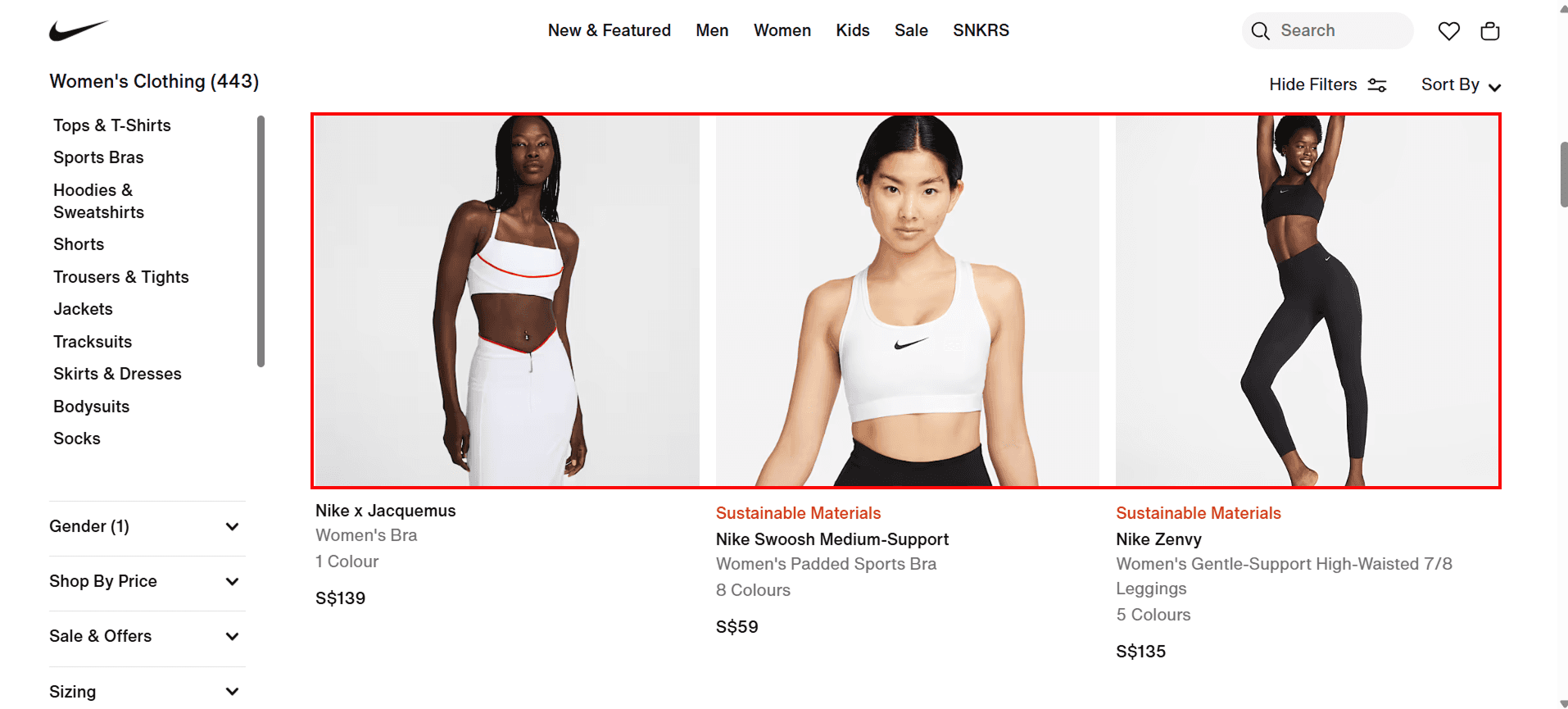
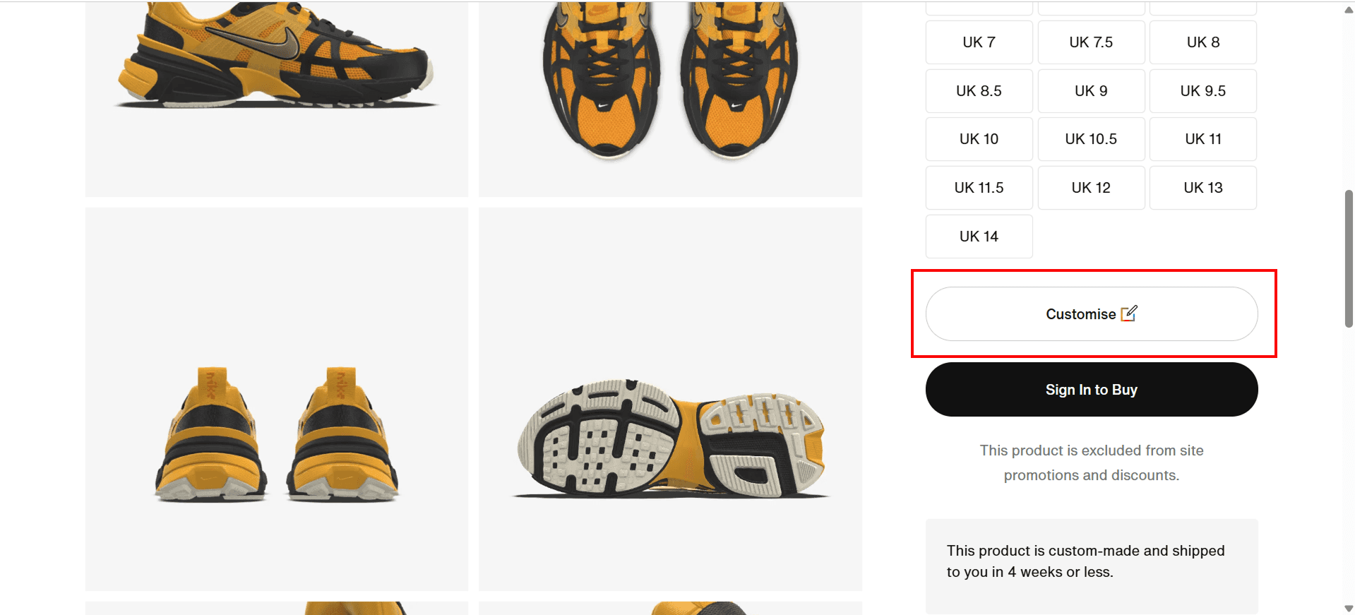
Nike does a beautiful job of celebrating diversity. Their models reflect a wide range of body types, ethnicities, and identities, making the brand feel inclusive and relatable to everyone. Plus, their product customization options add an extra layer of connection, giving users the freedom to express their own style and individuality. It’s design that not only looks good, but feels personal too.
Memory & Consistency
Nike’s brand consistency really shines through from the bold typography and clean visuals to the confident tone of voice and layout. The iconic Swoosh and signature messaging show up just enough to stay memorable without being repetitive. It all works together to create a strong, lasting impression that feels unmistakably Nike.
Final thoughts
In every scroll and click, Nike shows us that great design goes far beyond visuals — it’s about connection. From emotionally-driven storytelling and inclusive representation to smart hierarchy, color psychology, and seamless user flow, Nike’s website is a masterclass in thoughtful, human-centered design. Every element works together to not just sell a product, but to inspire, empower, and make users feel like they belong. As a designer, this study reinforces how powerful subtle choices can be when they’re made with intention — and how emotion, when used right, becomes one of the strongest tools in shaping unforgettable user experiences.