
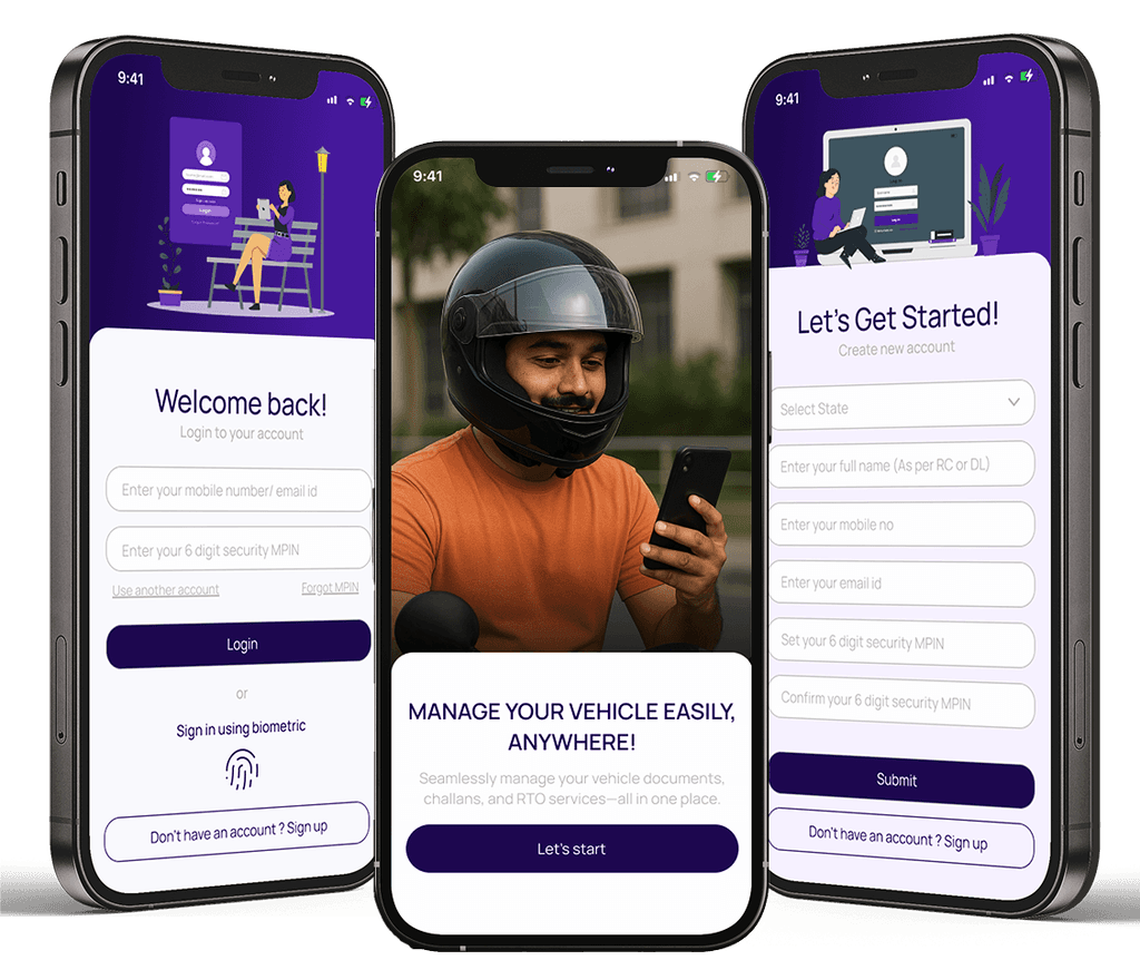
This project is about giving the mParivahan app a fresh, modern look with a simple and easy-to-use design. It includes quick access to important services. The new layout uses a violet theme, clean fonts, and helpful features to make managing vehicle-related tasks smoother for everyone.
Project type
Revamp / Mobile app
Tools
Figma / Miro
Timeline
Feb 2025
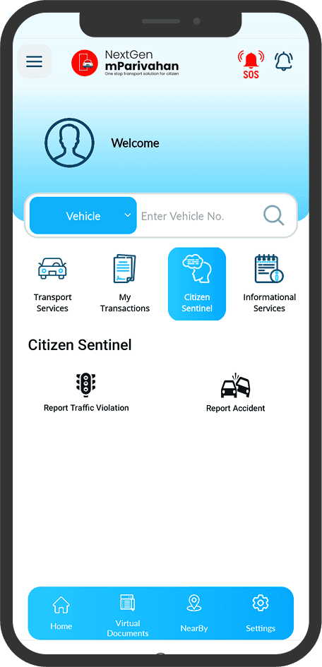
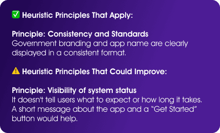
The design lacks clear active tab or visual cues, which makes it harder to know where you are
Important elements like user details and action buttons lacked focus or prioritization.
Felt like a generic layout, lacked visual or interaction cues reflecting trust and connection
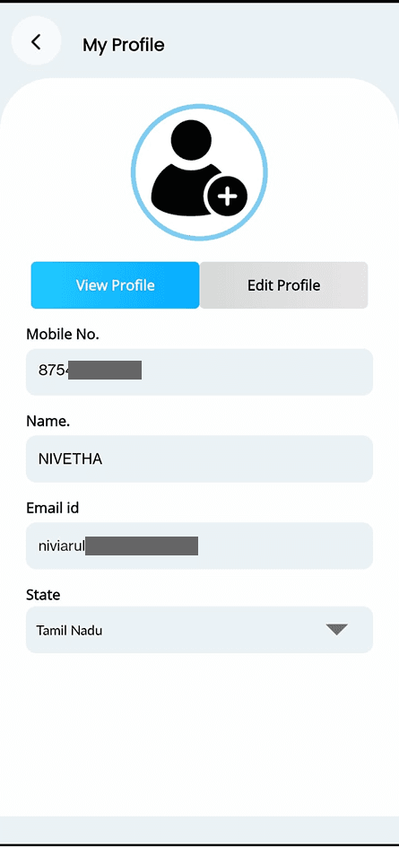
There’s no direct or inline editing. users must click through separate page which disrupting flow.
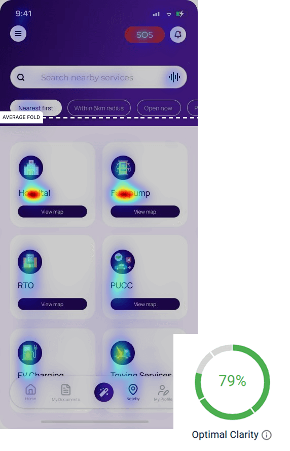
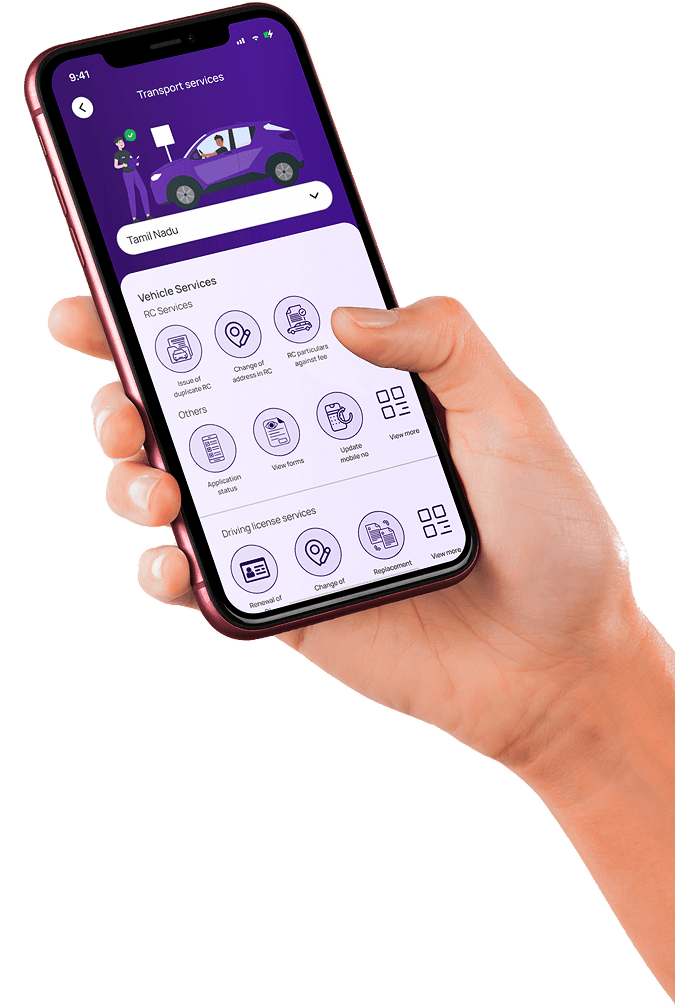
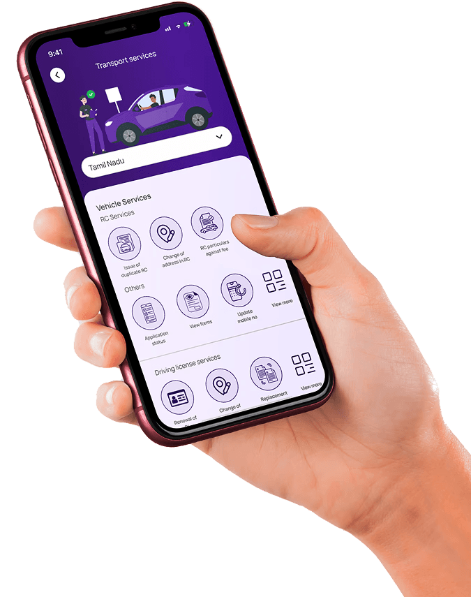
The app lacks filtering options, making it hard for users to quickly find the services they need. This slows down navigation and reduces overall user efficiency.
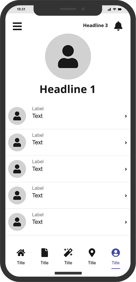
Bottom nav shows active tab visually, with icons that match function.
Bold heading fonts and lighter body text improve structure. Red accent highlights key actions like Delete and SOS.
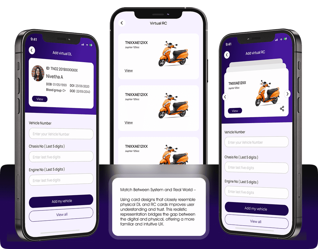
The new design integrates vehicle images and card-like layouts for RC and DL, mimicking real physical cards. This visual storytelling builds immediate recognition, trust, and ease of use.
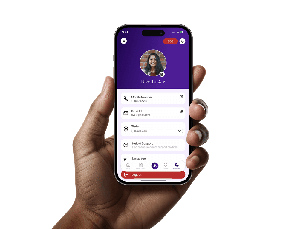
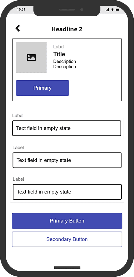
Fields now show edit icons next to them, letting users update information in one direct action
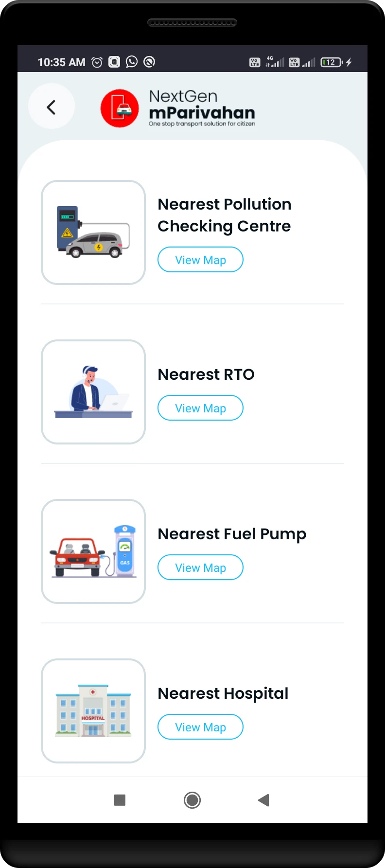
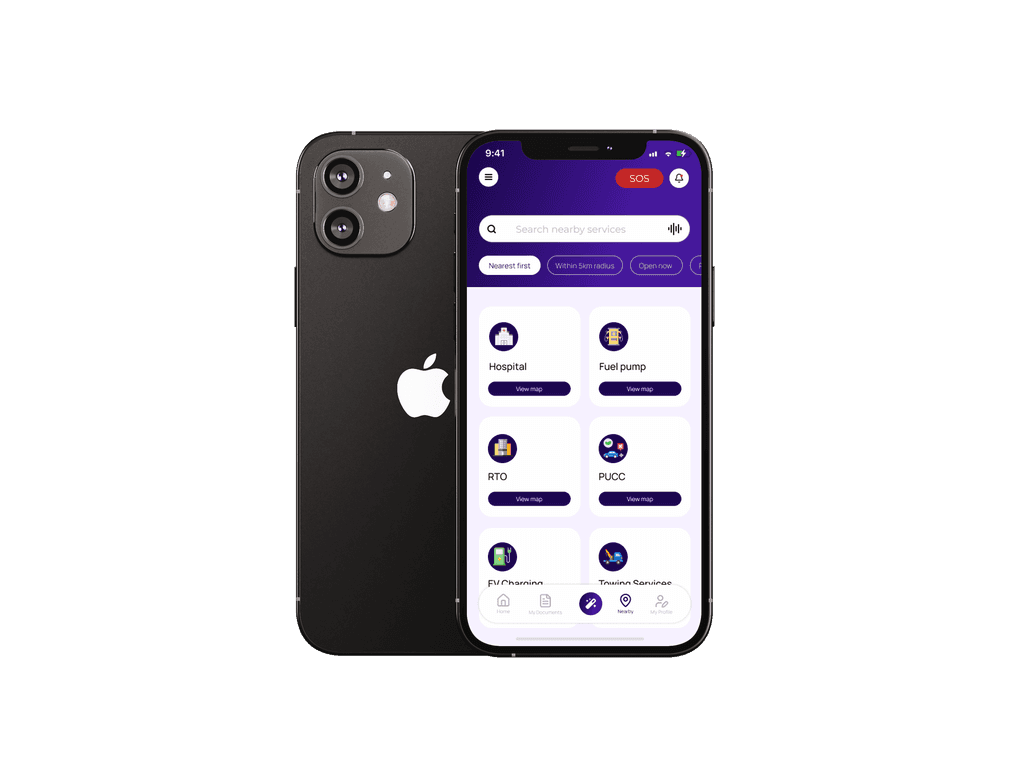
Newly added filter options help users quickly narrow down services like hospitals, fuel stations, or RTOs by distance or category

This user flow outlines the navigation path for the mParivahan app, starting from onboarding to accessing key features like virtual documents, transport services, and profile settings. It helps visualize how users move through the app and interact with its core functions.

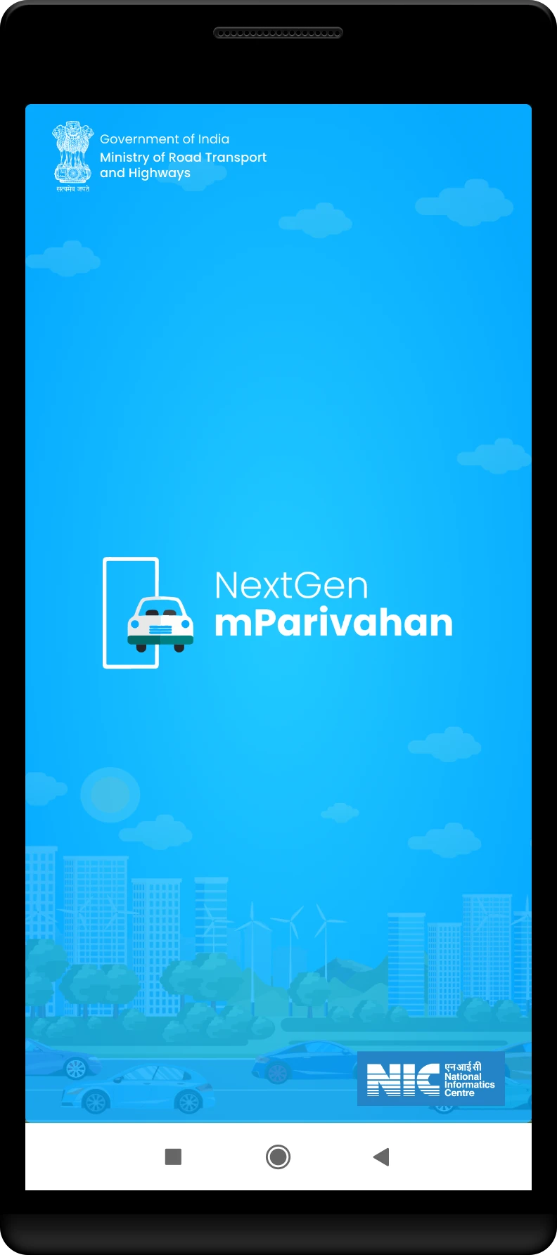
This bold and modern color choice gives mParivahan a trustworthy and sophisticated feel. It enhances user experience with a clean, high-contrast design, making the app stand out from traditional government platforms.

Manrope is a clean and modern font that makes the mParivahan app easy to read and use. Its simple design keeps everything clear and accessible for all users.

Weights: Regular, medium, semi - bold
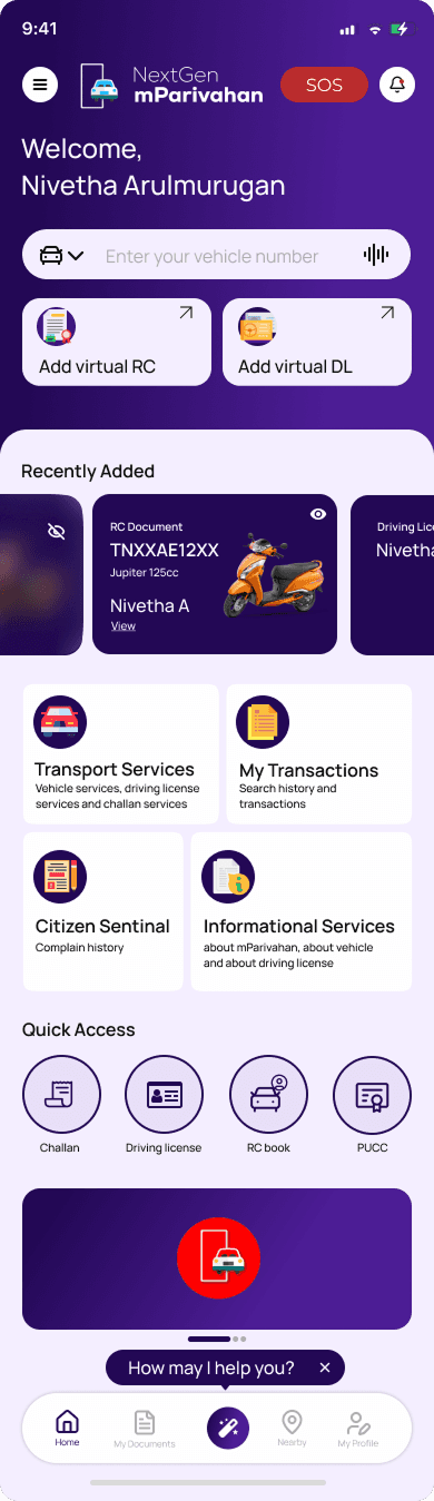
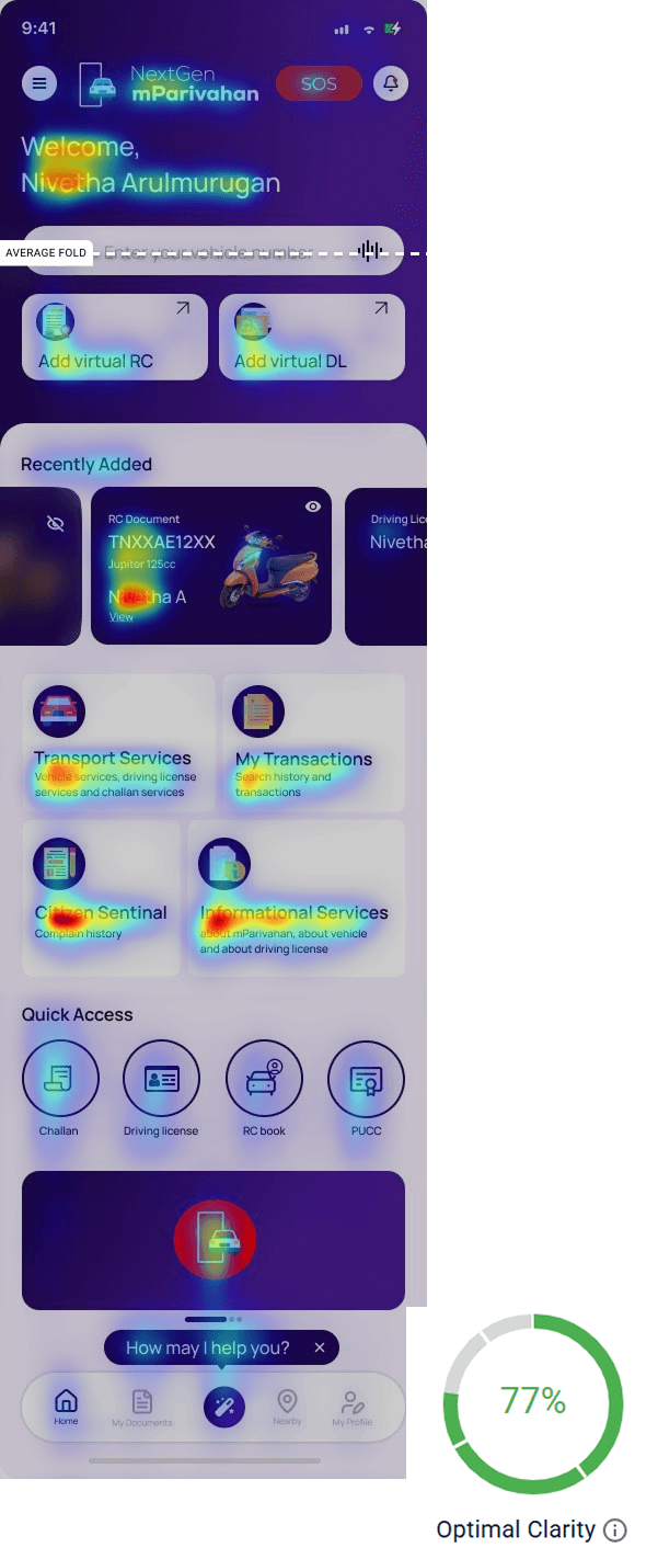
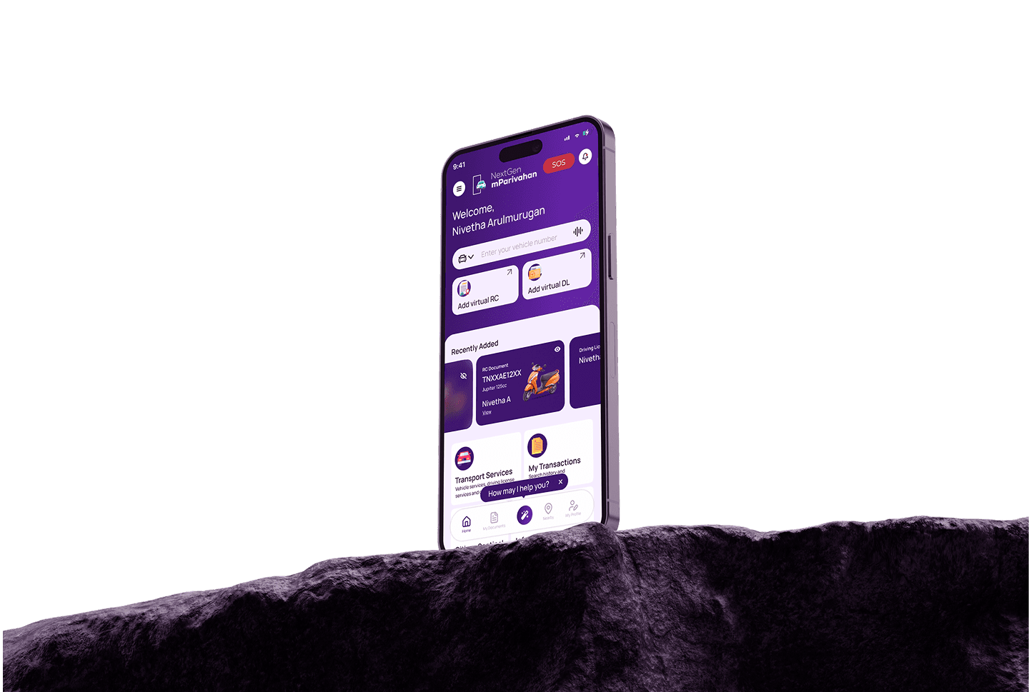
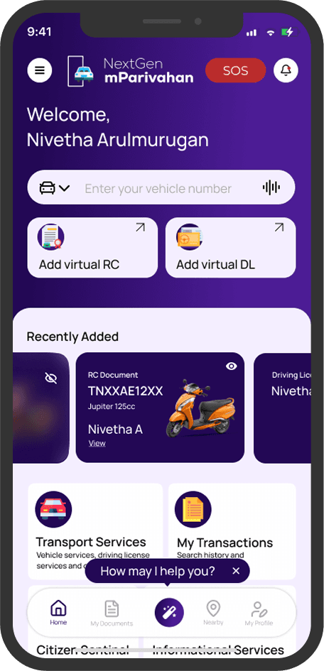
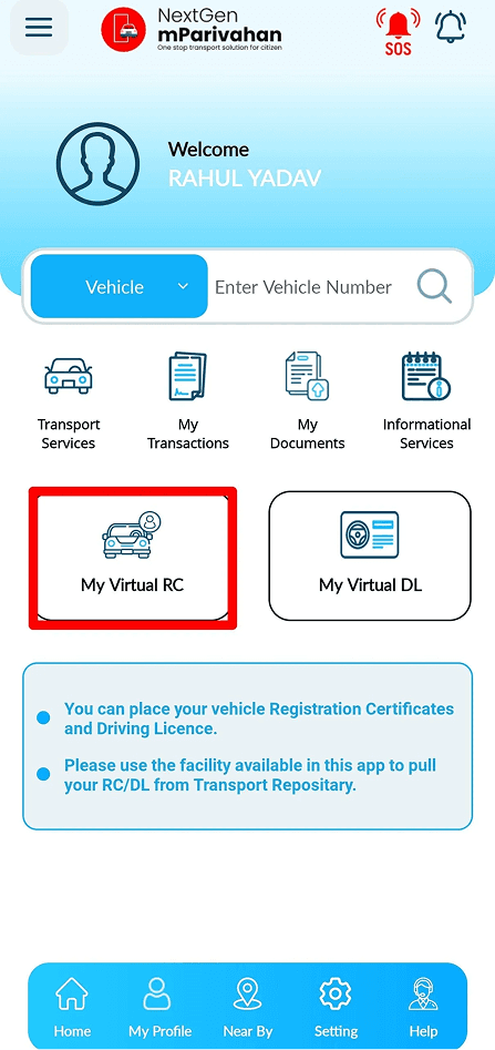
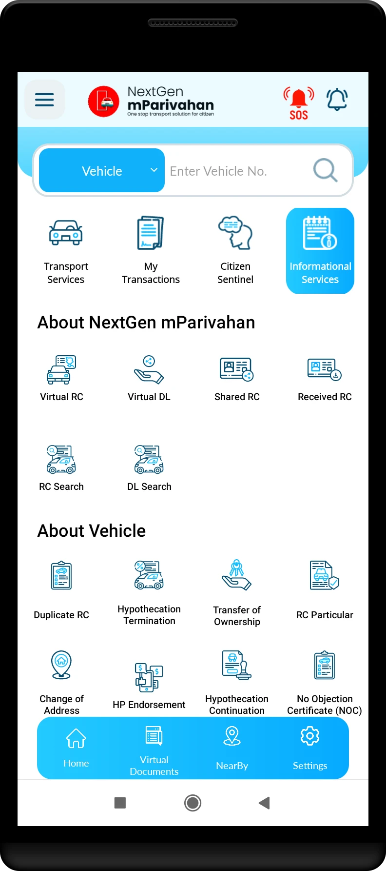
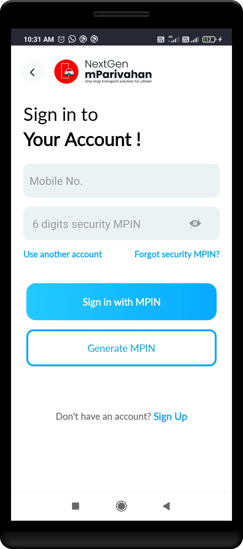
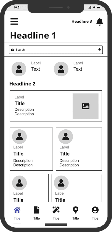
This redesigned home screen focuses on creating a clean, user-friendly interface with a personalized welcome, quick access to key services like virtual RC/DL, and recently added documents for easy retrieval. It uses a modern, minimal design with clear icons and sections for transport services, transactions, and information. The layout improves usability, aligns with heuristic principles, and offers features like quick shortcuts and help support to streamline the user experience.
The search bar now includes voice input, making it easier to find vehicle details quickly. Better grouping of services and quick-access buttons for RC and DL improve usability.
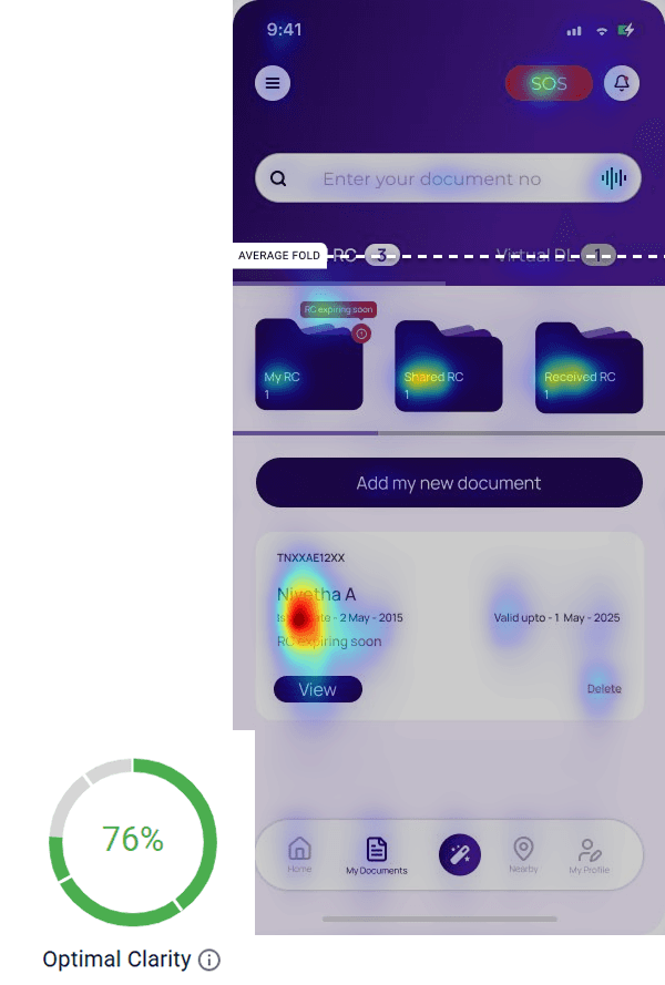
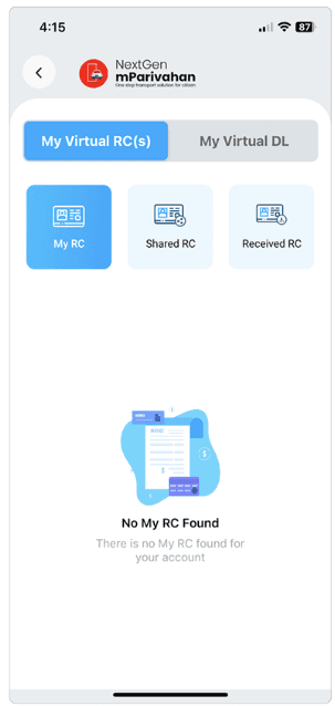
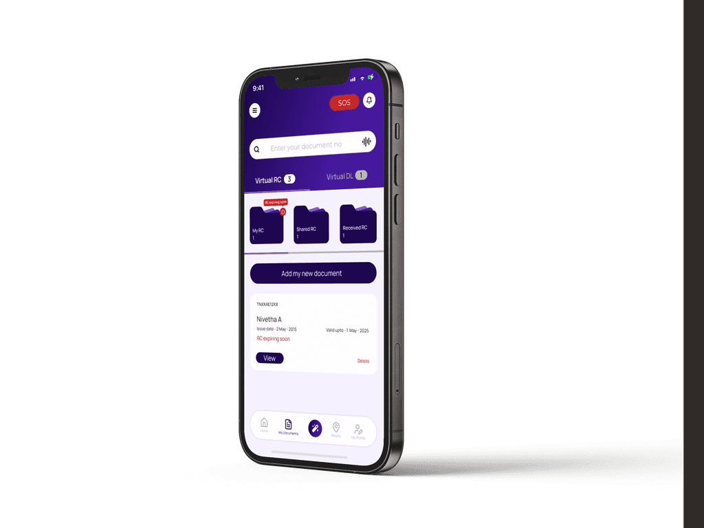
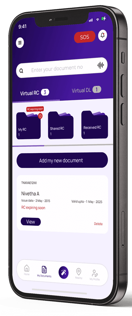
Users can instantly view their DL, RC, and other key documents in a carousel format, eliminating unnecessary navigation. With one-tap access, important details are always at their fingertips
The Bento Grid layout organizes key services for easy access, giving a quick preview of what each button offers.
Even though there’s a section with articles about the services, adding an AI assistant would help users get answers faster and more easily, saving time.
The new design provides a clear page indication, unlike the old app, ensuring users always know where they are within the app.


I used color hierarchy to clearly highlight delete actions and warnings, making them stand out for better visibility.
To make it easier for users, the Add option is placed right on the Documents page, allowing quick access without the need to switch screens or go through extra steps.
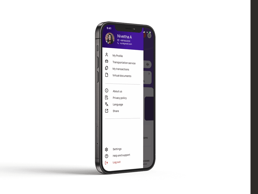
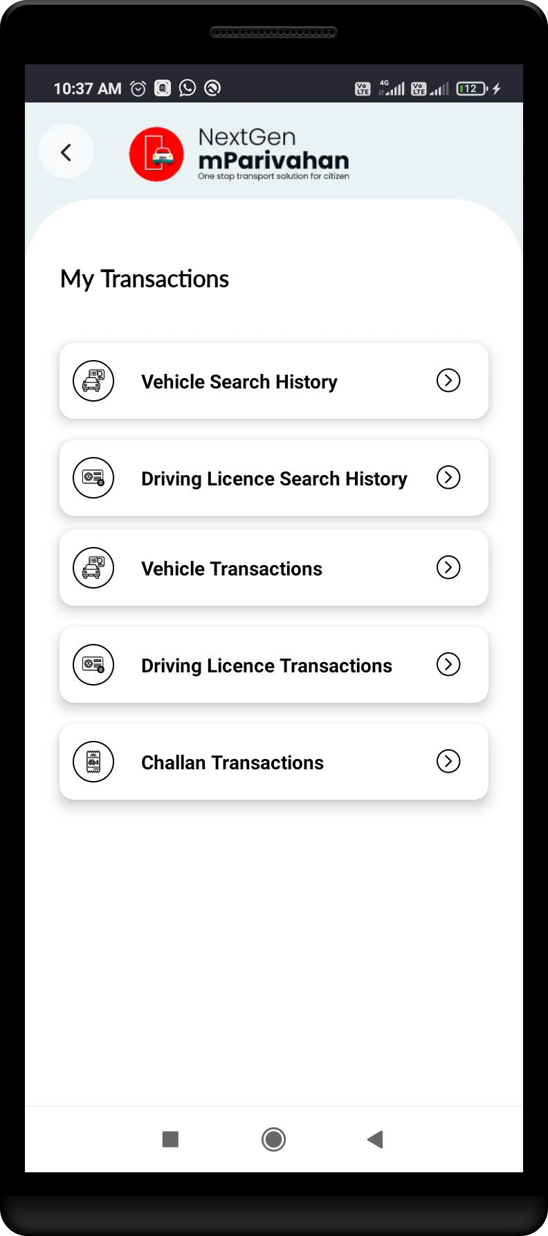
Following the Law of Proximity, related options are grouped for quick and intuitive navigation—key features at the top, settings and support at the bottom.