Connecting consumers to timeless luxury homes

Connecting consumers to timeless luxury

homes

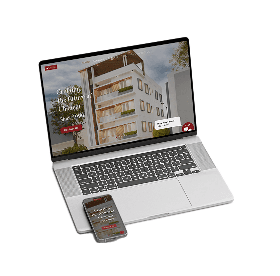
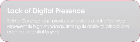
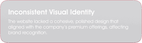
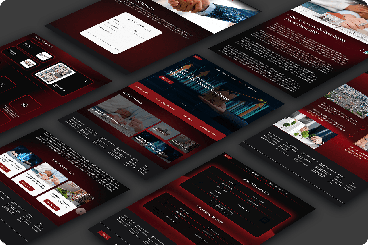
Salma Constructions empowers discerning homebuyers by showcasing their commitment to trust and luxury through a refined digital presence. I worked closely with the team to understand client needs and revamp the website, delivering an intuitive platform that highlights the brand's quality, elegance, and key values.

Agency

Ping us

Project type

Construction / Website / Mobile View

Role

Ui / Ux Designer

Tools

Figma / FIgjam

Timeline

February - April 2024

My role & impact

Oversaw the website redesign for Salma Constructions, developing wireframes and high-fidelity prototypes to ensure a smooth and intuitive user experience. Delivered design files for developer handoff, facilitating seamless execution.


Produced regular client update presentations, set clear objectives for meetings, and maintained consistent communication with developers throughout the process, fostering alignment and ensuring efficient project execution.


Research

User Interviews

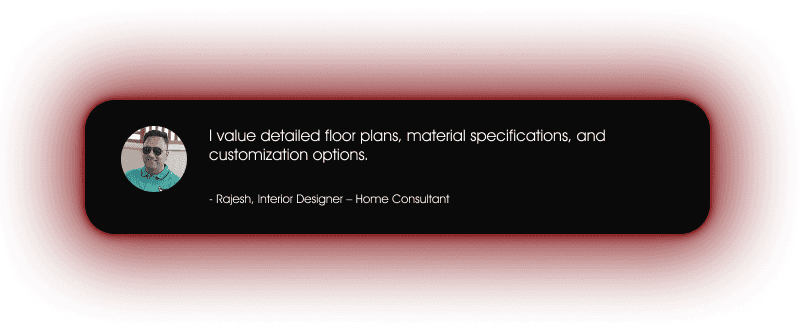
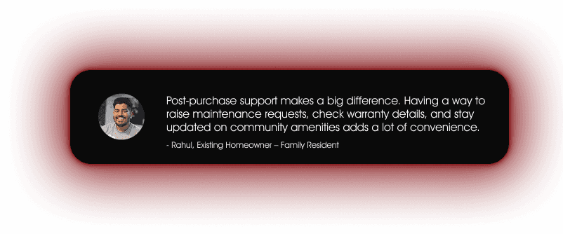
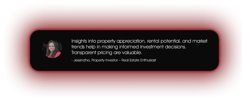
I conducted user interviews with potential website users through casual, day-to-day discussions. A selected few insights are showcased here.

Competitior Analysis

I worked on this competitor analysis to identify key takeaways and insights that we can adapt and implement in our website. By studying their strengths and areas for improvement, we can refine our approach to enhance user experience and improve navigation,

Takeaways

A well-designed search bar enhances user experience by making information easily accessible.

Casagrand effectively integrates strategic CTAs throughout the website, ensuring users are encouraged to take action at every stage.

The website focuses on a sleek, high-end look, creating a sense of exclusivity.


Well-organized sections and subtle animations

The homepage is neat and uncluttered, making navigation smooth and user-friendly.

Tags like "Trending" and "Fast Delivery" on products provide quick, useful information, helping users make faster purchase decisions.

Improvement area

Some pop-ups and lead generation forms may feels intrusive


The website presents a lot of text-heavy content, which can be overwhelming. A more concise approach with information and interactive elements could improve engagement.
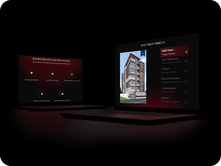
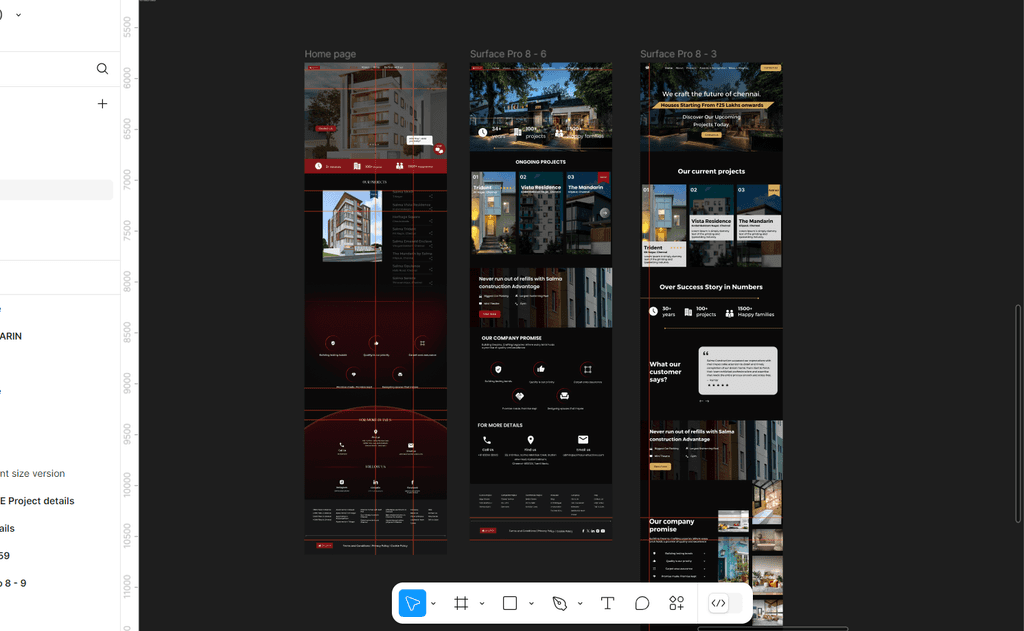
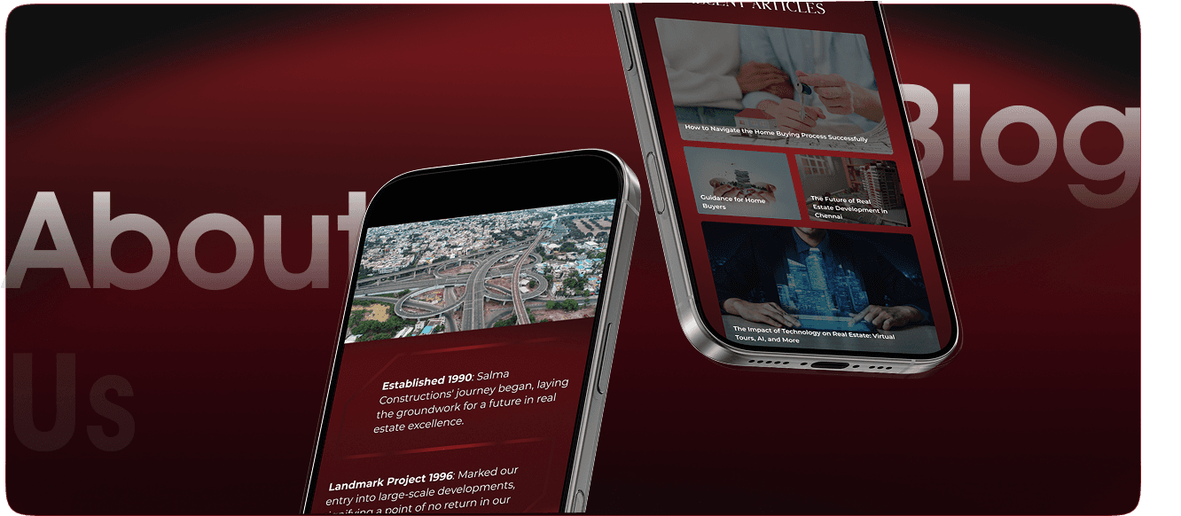
The navigation bar works well but could be simpler. Streamlining options would improve usability and quick access.’

Unlike competitors, key details like floor plans and pricing are not immediately available.

Takeaways

Lifestyle images alongside product images helps customers visualize the

product in real life.

The "Watch & Buy" feature, with a video and specs, gives a quick product overview.


Displaying product recommendations as chips is a remarkable touch.

The homepage is neat and uncluttered, making navigation smooth and user-friendly.

Tags like "Trending" and "Fast Delivery" on products provide quick, useful information, helping users make faster purchase decisions.

Improvement area

CTAs should stand out more for better conversions.

Home page

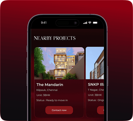
Kept it simple while maintaining a premium feel. Highlighted projects throughout, subtly encouraging customers to enquire about the properties. Instead of overwhelming visitors with too much information upfront, provided just enough details to spark interest and encourage further exploration.

Designed the these section to reinforce the brand’s values and commitment to quality. Used icons and short statements to highlight key principles like trust, excellence, and ethical engagement. Kept the layout clean and structured, making it easy for users to understand the brand’s promise at a glance.

Showcased projects upfront to help users easily explore and enquire. Added tags on project images to highlight the status at a glance. Kept the design clean and visually engaging with large images and a simple project list for quick browsing. Made sure users can find information easily without feeling overwhelmed.

Showcased projects upfront to help users easily explore and enquire.

Added tags on project images to highlight the status at a glance.

Kept the design clean and visually engaging with large images

and a simple project list for quick browsing. Made sure users can

find information easily without feeling overwhelmed.

Designed this section to reinforce the brand’s values and

commitment to quality. Used icons and short statements to

highlight key principles like trust, excellence, and ethical

engagement. Kept the layout clean and structured, making

it easy for users to understand the brand’s promise at a glance.

Designed the these section to reinforce the brand’s values and commitment to quality. Used icons and short statements to highlight key principles like trust, excellence, and ethical engagement. Kept the layout clean and structured, making it easy for users to understand the brand’s promise at a glance.

Showcased projects upfront to help users easily explore and enquire. Added tags on project images to highlight the status at a glance. Kept the design clean and visually engaging with large images and a simple project list for quick browsing. Made sure users can find information easily without feeling overwhelmed.

Showcased projects upfront to help users easily explore

and enquire. Added tags on project images to

highlight the status at a glance. Kept the design clean

and visually engaging with large images and a simple

project list for quick browsing. Made sure users can

find information easily without feeling overwhelmed.

Designed the these section to reinforce the

brand’s values and commitment to quality.

Used icons and short statements to highlight key

principles like trust, excellence, and ethical

engagement. Kept the layout clean and

structured, making it easy for users to understand

the brand’s promise at a glance.

Designed the these section to reinforce the brand’s values and commitment to quality. Used icons and short statements to highlight key principles like trust, excellence, and ethical engagement. Kept the layout clean and structured, making it easy for users to understand the brand’s promise at a glance.

Showcased projects upfront to help users easily explore and enquire. Added tags on project images to highlight the status at a glance. Kept the design clean and visually engaging with large images and a simple project list for quick browsing. Made sure users can find information easily without feeling overwhelmed.

Showcased projects upfront to help users easily explore and enquire.

Added tags on project images to highlight the status at a glance.

Kept the design clean and visually engaging with large images

and a simple project list for quick browsing. Made sure users can

find information easily without feeling overwhelmed.

Designed this section to reinforce the brand’s values and

commitment to quality. Used icons and short statements to

highlight key principles like trust, excellence, and ethical

engagement. Kept the layout clean and structured, making

it easy for users to understand the brand’s promise at a glance.

I wanted the design to make exploring the property seamless while

keeping it visually engaging. Placing the main image and key details

like price and availability upfront ensures users get the most important

information instantly. I structured the project details to be clear and

concise, avoiding unnecessary clutter. Floor plans are easy

to preview, and amenities are displayed with icons for quick recognition.

Highlighting nearby landmarks reinforces the project’s prime location.

I wanted the design to make exploring the property

seamless while keeping it visually engaging. Placing

the main image and key details like price and

availability upfront ensures users get the most

important information instantly. I structured the

project details to be clear and concise, avoiding

unnecessary clutter. Floor plans are easy to preview,

and amenities are displayed with icons for quick

recognition. Highlighting nearby landmarks

reinforces the project’s prime location.

I wanted the design to make exploring the property seamless while keeping it visually engaging. Placing the main image and key details like price and availability upfront ensures users get the most important information instantly. I structured the project details to be clear and concise, avoiding unnecessary clutter. Floor plans are easy to preview, and amenities are displayed with icons for quick recognition. Highlighting nearby landmarks reinforces the project’s prime location.

I wanted the design to make exploring the property seamless while keeping it visually engaging. Placing the main image and key details like price and availability upfront ensures users get the most important information instantly. I structured the project details to be clear and concise, avoiding unnecessary clutter. Floor plans are easy to preview, and amenities are displayed with icons for quick recognition. Highlighting nearby landmarks reinforces the project’s prime location.

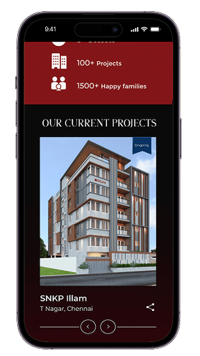
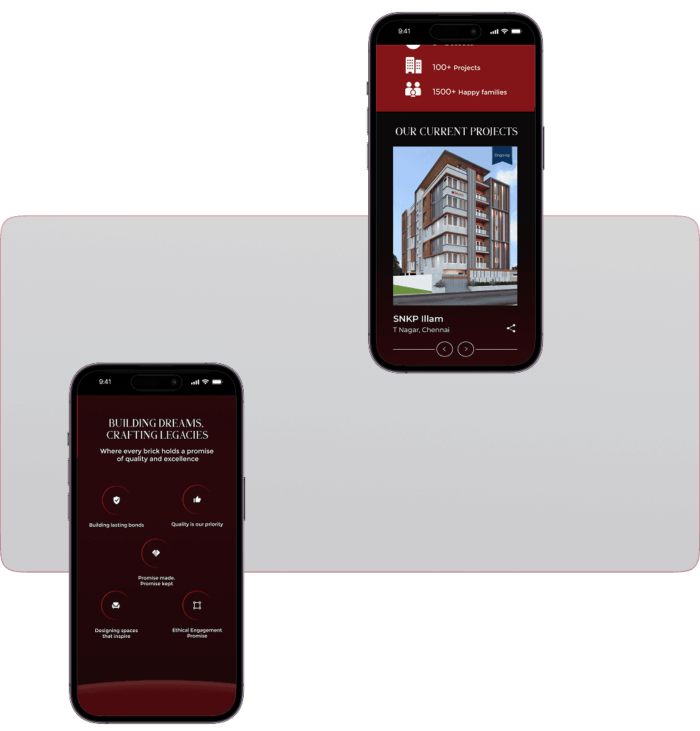
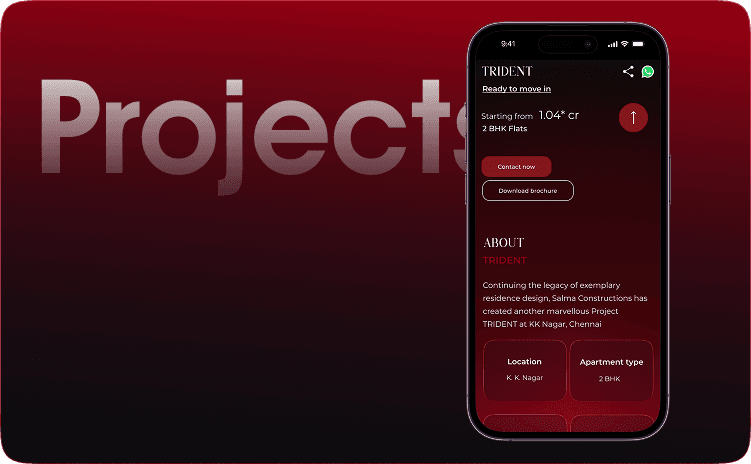
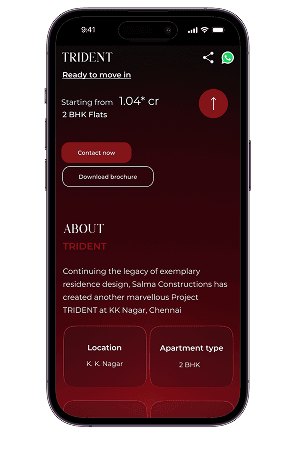
Based on user interviews, I focused on providing key project details like floor plans, material specifications, etc to ensure transparency and easy decision-making.

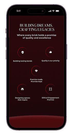
The client wanted subtle micro-animations to enhance the browsing experience without overwhelming users. These animations create a smooth, engaging flow, subtly guiding users through the website while maintaining a refined look.

Balancing user needs and client expectations, I kept key information as the focus while using visuals to enhance the experience. The result is a functional, visually appealing website that offers a seamless user journey.

Aboutus

The information is arranged in a way that tells a clear story. It starts with a strong introduction to build trust, followed by key milestones shown in a timeline.

Blogs

Based on user interviews, I focused on incorporating a dedicated trends section where the brand shares valuable insights through blogs. This helps customers make better decisions while also enhancing the brand’s presence as a knowledgeable and trusted name in the industry.

The information is arranged in a way that tells a clear story.

It starts with a strong introduction to build trust, followed by

key milestones shown in a timeline.

Based on user interviews, I focused on incorporating a dedicated

trends section where the brand shares valuable insights through blogs.

This helps customers make better decisions while also enhancing the

brand’s presence as a knowledgeable and trusted name in the industry.

The information is arranged in a way that tells a clear story.

It starts with a strong introduction to build trust, followed by

key milestones shown in a timeline.

Based on user interviews, I focused on incorporating a dedicated trends section where the brand shares valuable insights through blogs. This helps customers make better decisions while also enhancing the brand’s presence as a knowledgeable and trusted name in the industry.

The information is arranged in a way that tells a clear story.

It starts with a strong introduction to build trust, followed by

key milestones shown in a timeline.

Based on user interviews, I focused on incorporating a dedicated

trends section where the brand shares valuable insights through blogs.

This helps customers make better decisions while also enhancing the

brand’s presence as a knowledgeable and trusted name in the industry.

Aboutus

The information is arranged in a way that tells a clear story. It starts with a strong introduction to build trust, followed by key milestones shown in a timeline.

Blogs

Based on user interviews, I focused on incorporating a dedicated trends section where the brand shares valuable insights through blogs. This helps customers make better decisions while also enhancing the brand’s presence as a knowledgeable and trusted name in the industry.

The information is arranged in a way that tells a clear story.

It starts with a strong introduction to build trust, followed by

key milestones shown in a timeline.

Based on user interviews, I focused on incorporating a dedicated

trends section where the brand shares valuable insights through blogs.

This helps customers make better decisions while also enhancing the

brand’s presence as a knowledgeable and trusted name in the industry.

Montserrat (Regular / Semibold)

ABCDEFGHIJKLMNOQRSTUVWXYZ

abcdefghijkmnopqestuvwxyz

1234567890

Aa

Aa

Philip Muler

ABCDEFGHIJKLMNOQRSTUVWXYZ

abcdefghijkmnopqestuvwxyz

1234567890

Montserrat (Regular / Semibold)

ABCDEFGHIJKLMNOQRSTUVWXYZ

abcdefghijkmnopqestuvwxyz

1234567890

Aa

Aa

Philip Muler

ABCDEFGHIJKLMNOQRSTUVWXYZ

abcdefghijkmnopqestuvwxyz

1234567890

Avenir
(Regular / Semibold)

ABCDEFGHIJKLMNOQRSTUVWXYZ

abcdefghijkmnopqestuvwxyz

1234567890

Aa

Aa

Philip Muler

ABCDEFGHIJKLMNOQRSTUVWXYZ

abcdefghijkmnopqestuvwxyz

1234567890

User Testing & Iterations

Design Foundation

The client wanted a dark-themed website, which set the
foundation for the design. This guided the overall aesthetic
and design approach.

This was my first e-commerce
project, and I had to learn how
to incorporate features that build trust and improve analytics in a competitive market.

Navigating Shopify

Since Shopify was new to me,
getting familiar with its structure
and capabilities was a challenge. I explored its tools and functionalities, while implementing the required
features efficiently.

Refinement Process

Through two iterations and finalizing in the third, we refined
the design based on user feedback. The client chose to
move away from gold, traditionally linked with luxury, and
instead, we introduced rich red tones with gradients for a
sophisticated feel.

Since Shopify was new to me, getting familiar with its structure and capabilities was a challenge. I explored its tools and functionalities, while implementing the required features efficiently.

Iterative Improvements

I worked closely with the client,
ensuring clear communication
throughout the process. We followed an iterative approach, making small refinements at each stage

User Experience

User feedback led us to focus on minimal content while
incorporating subtle micro-animations. This ensured a
clean, engaging, and user-friendly experience without
overwhelming the audience

I worked closely with the client, ensuring clear
communication throughout the process. We followed an iterative approach, making small refinements at each stage.

Key Learnings

This was my first project, and I had the chance to apply UX laws in real-life scenarios. I learned the importance of working closely with my team and keeping clear communication to make the project successful. Staying connected with developers helped us make design changes quickly and accurately.


We followed an iterative process, testing and improving the designs in each round. This helped us make the designs better step by step and ensure they worked well for users and met their needs.

Adding Property comparison, videos and testimonials could have been better.

My Other Works

Let's Connect

Let's Connect

Let's Connect

Create a free website with Framer, the website builder loved by startups, designers and agencies.