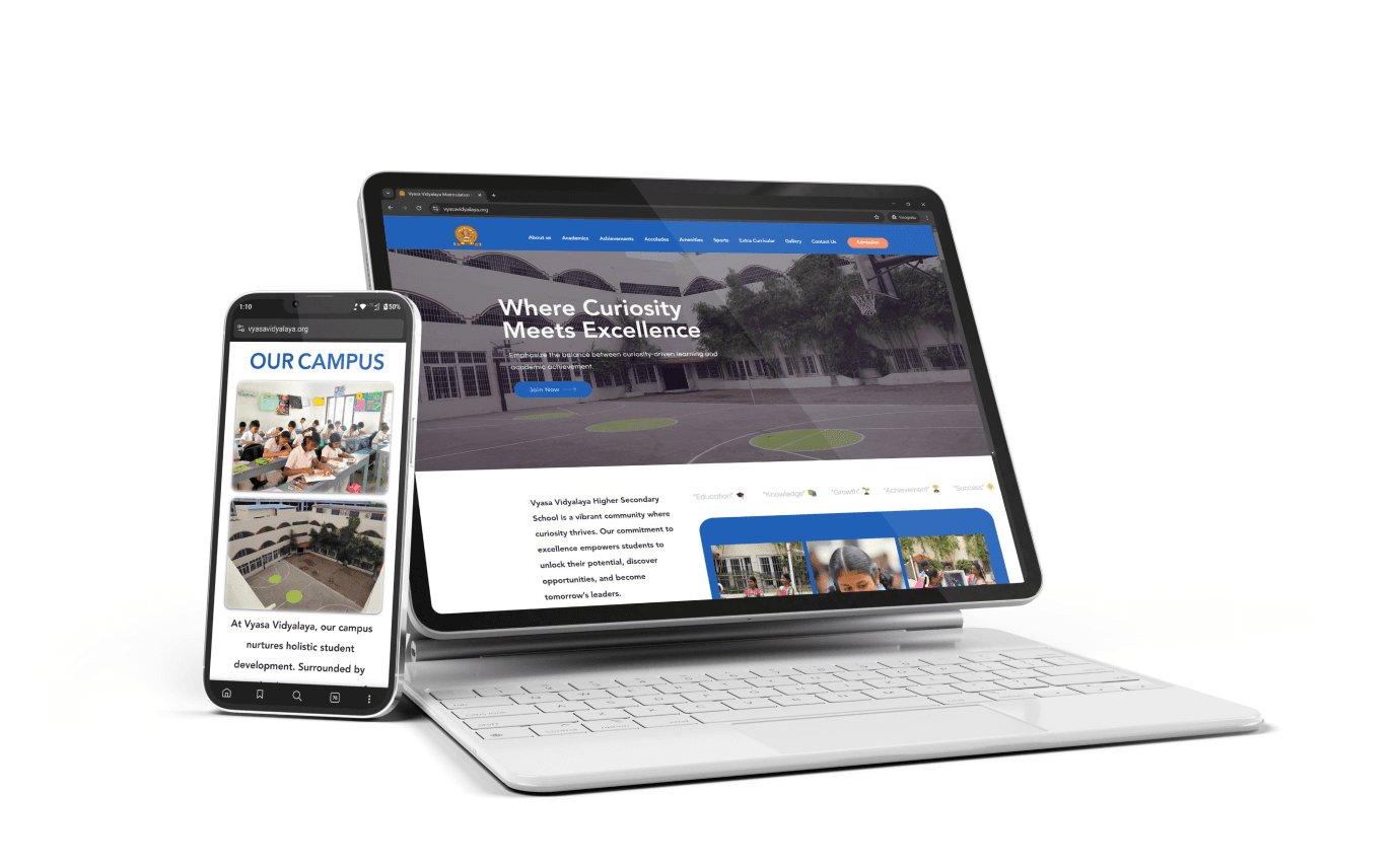
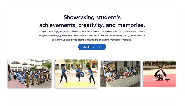
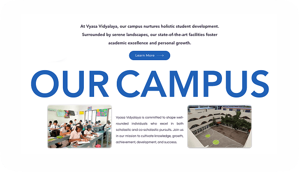
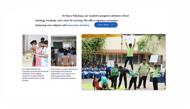
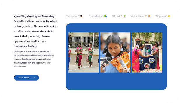
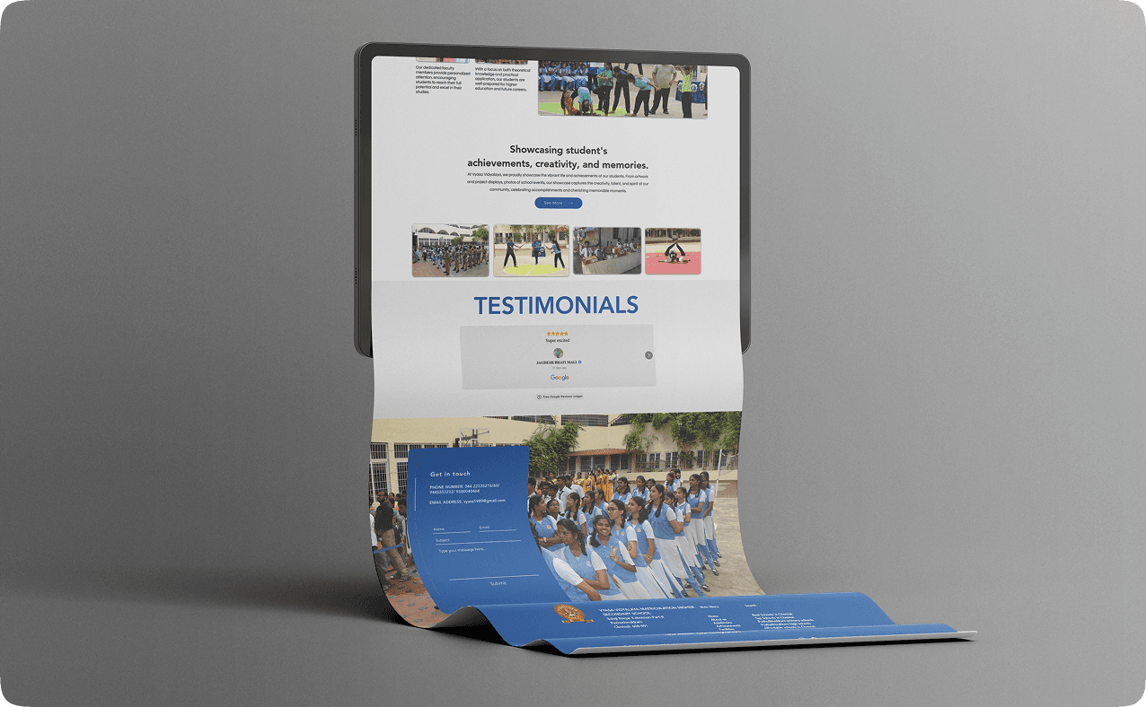
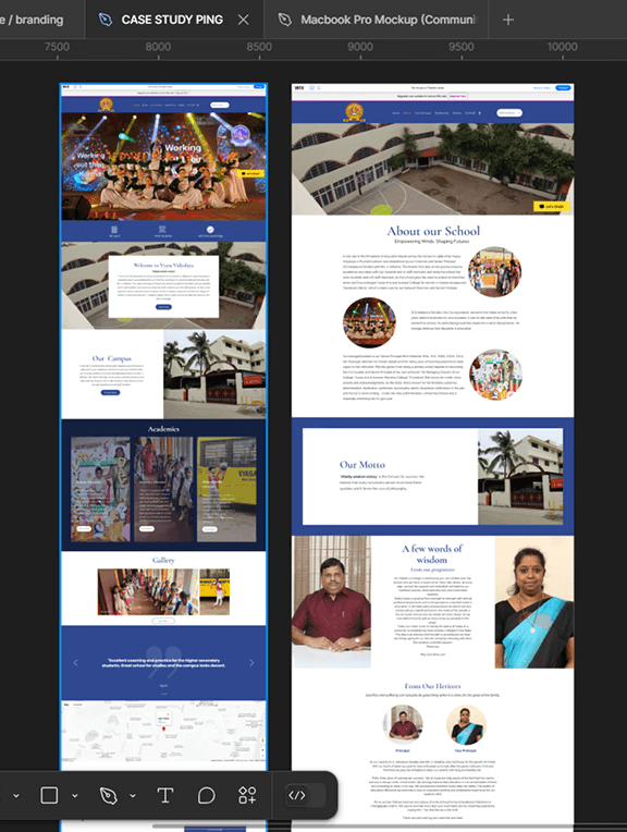
Vyasa Vidyalaya is a dynamic school in Chennai dedicated to fostering holistic development. With a focus on critical thinking, creativity, and academic excellence, the school provides a balanced curriculum that nurtures both scholastic and co-scholastic growth. The serene campus, state-of-the-art facilities, and personalized faculty attention create an environment where students excel in all areas, preparing them for future success. The school proudly showcases its students' achievements, creativity, and memorable moments.
Agency
Brandcode
Project type
Education / Website / Mobile View
View project
https://www.vyasavidyalaya.org/
Role
Ui / Ux Designer
Tools
Figma / Wix
Timeline
July - November 2024
My role & impact
I led the creation of a unique and modern website for Vyasa Vidyalaya, focusing on a clean, image-driven design that reflects the school's ethos. Research revealed that most education websites prioritize content over design, so I aimed to create something distinctive. I developed wireframes to ensure an intuitive user experience. Throughout the process, I maintained clear communication with the development team to ensure smooth execution and alignment with the project's vision.

Research
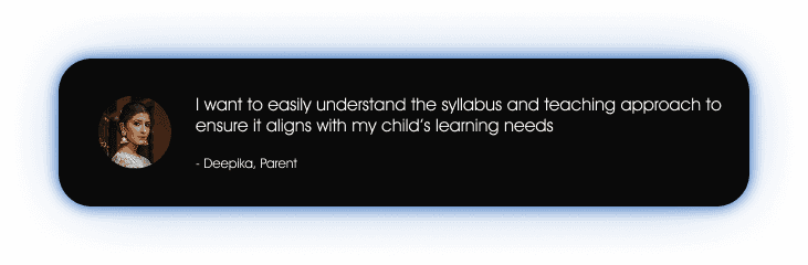
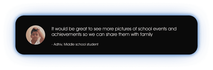
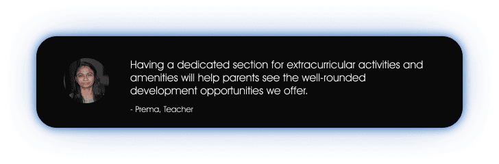
User Interviews
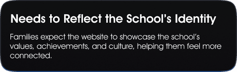
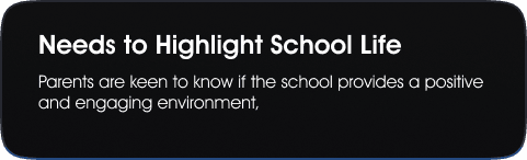
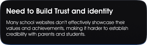
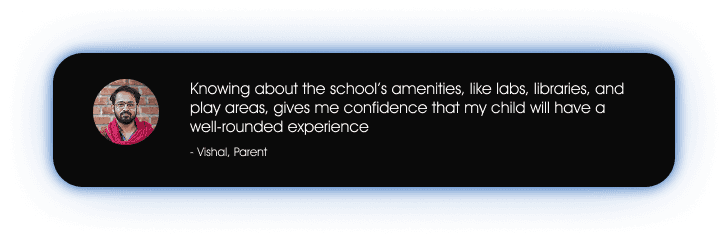
I conducted user interviews with potential website users through casual, day-to-day discussions. A selected few insights are showcased here.
Competitior Analysis
I worked on this competitor analysis to identify key takeaways and insights that we can adapt and implement in our website. By studying their strengths and areas for improvement, we can refine our approach to enhance user experience and improve navigation,


Takeaways
The website has a well-structured layout, making navigation easy and content accessible.
Key details are included to help parents make informed decisions.
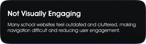
Improvement area
Human images add warmth, but campus shots would better showcase the school environment.
Admissions CTA Could Be Stronger – The admissions process is clear, but more prominent CTAs could enhance user engagement.
The cursor animation feels optional and doesn’t contribute much to the experience.


ABCDEFGHIJKLMNOQRSTUVWXYZ
abcdefghijkmnopqestuvwxyz
1234567890
Aa
Aa
ABCDEFGHIJKLMNOQRSTUVWXYZ
abcdefghijkmnopqestuvwxyz
1234567890
User Testing & Iterations
At first, I designed with a straightforward approach, but the client wanted the homepage to feel more playful while keeping the rest of the site formal. In the iteration, I introduced more CTAs to enhance engagement and guide users more effectively. I also avoided a rigid pattern in organizing the content, allowing for a more natural and engaging flow. Additionally, I used bold typography as a stylistic choice to add character and make certain sections stand out.
Key Learnings